> ## Documentation Index
> Fetch the complete documentation index at: https://calcs.com/docs/llms.txt
> Use this file to discover all available pages before exploring further.
# Table Widget
> Create flexible tables with multiple column types for data organization and manipulation
## Widget Core Function
The Table Widget is very versatile and acts as a kind of container for sub-widgets. It can include Input, Computed, Lookup, Hidden, or LinkRow column types. You can create tables by:
* Computing each column
* Asking the user for data entry or data selection
* Setting labels and text outputs
The table widget is similar to Excel tables - you can have cells for data entry, formulas, dropdowns, etc. The key difference is that you create different modes of "column" creation rather than individual "cell" creation.
## UI Experience
Users can input data, expand rows, and interact with different column types
Display computed results and organized data in tabular format
## Data Organization and Manipulation
* **Primary widget** for creating tables
* Each column can be set as a sub-widget
* Sub-widgets have most but not all capabilities of standalone widgets
Watch the How-to Videos:
* [Create a Table Widget](https://www.loom.com/share/5252e72effbe4b548be068a39a0b9a9f)
* Create a Table Widget with Mixed Sub-widgets
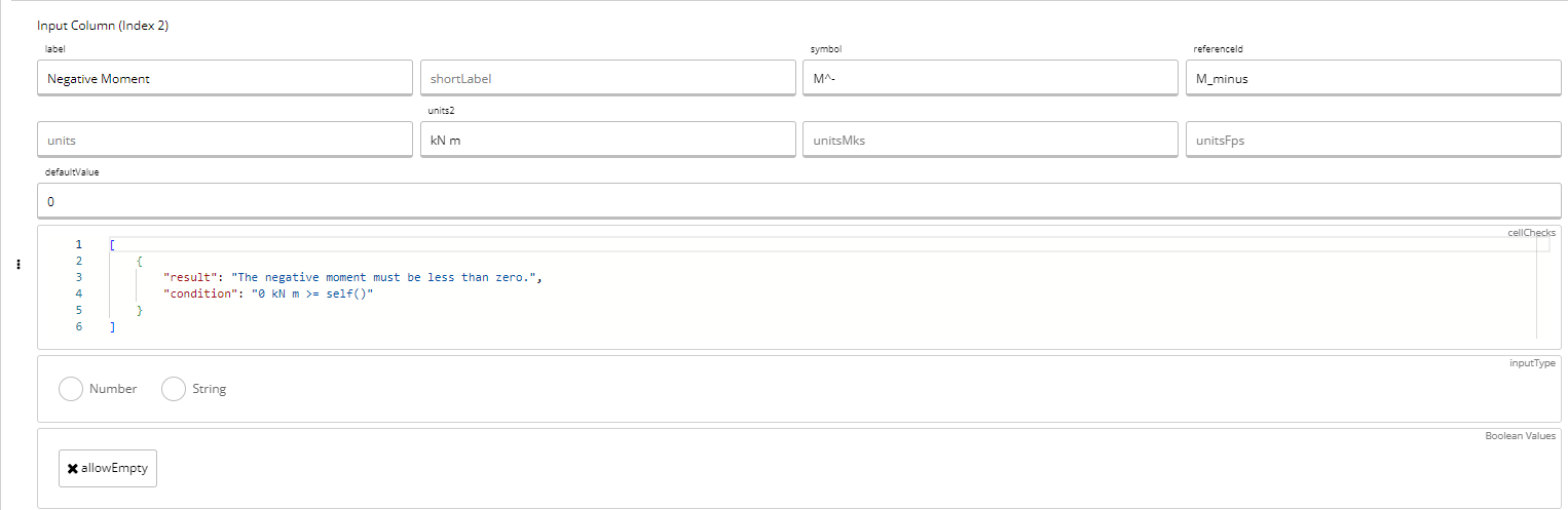
## Cell Checks
To add cell checks, use JSON form in the `cellCheck` field:
```json theme={null}
[
{
"result": "",
"condition": ""
}
]
```
### Example Cell Check
This example from the `cfsSteelMemberAS4600-2018` template adds a cell check in the third cell where users can only input negative values for negative moment:
## Example Code
```json theme={null}
{
"type": "sheetTemplateWidgets",
"attributes": {
"type": "table",
"referenceId": "",
"label": "",
"symbol": "",
"expand": false,
"tableLength": "",
"defaultValue": [],
"visibleIf": "",
"export": false,
"dataColumns": [],
"references": "",
"description": "",
"authorNotes": ""
}
}
```
## Parameters
Must be "table" - defines the widget type
The name of the widget
Symbol for the widget displayed in KaTeX format
Whether the table will be expandable by user input. At least one column must be `"type": "input"`, and this may NOT be `true` if `tableLength` is defined
An equation that must resolve to an integer, defining the number of rows to display. Most useful if your table has all `"type": "computed"` columns
Array of default values for initial display in the table
An equation that must result in true/false and can hide the widget if certain conditions are met. If `visibleIf==false`, any fields referencing this table will error
Whether to export the widget value for use elsewhere in the platform, such as in load linking
Defines all columns in the table, which may consist of several types of columns
Unique reference ID of the widget
Description of the table (not currently displayed, but will be)
Relevant code or standard reference for the table
Internal development notes; never displayed publicly
Any image specifically relevant to the widget
## Examples from Current Calculators
| Reference IDs | Calculator Link |
| -------------------- | -------------------------------------------------------------------------------------------------------------------------------------------------- |
| computed **(s\_t-)** | [CFS Steel Member AS4600-2018](https://calcs.com/organisation/2ad7e5c6-8d23-416d-acb1-5487dc65150a/templates/6d7fc7ed-f6f7-4392-822b-cdee58bab93b) |
## Important Notes
The table widget resolves to a matrix of values that can be subset, mutated, or exported for various computations.
## Best Practices
* Use appropriate column types for your data needs
* Consider using `tableLength` for computed-only tables
* Implement cell checks to validate user input
* Use `expand` functionality when users need to add variable numbers of entries
* Always provide meaningful labels and references