The Image Widget is separate from the diagram widget and displays static images that can be changed based on certain conditions. These widgets act as narrative tools for end users to understand what is being designed and how inputs are expected to be used.
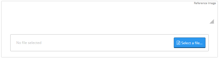
Images can also be added under widgets within the “Reference Image” section. Local files can be uploaded, but images from standards/references/guides should be avoided and should either be ignored or replicated.
Image Widget Example

Example Code

{
  "type": "sheetTemplateWidgets",
  "attributes": {
    "type": "image",
    "label": "",
    "visibleIf": "",
    "referenceId": "image",
    "equation": [
      {
        "condition": "@default",
        "result": "\"imageID1\""
      }
    ],
    "image": {
      "imageID1": {
        "inline": "insert data uri"
      }
    },
    "references": "",
    "description": "",
    "authorNotes": ""
  }
}

Parameters

type
string
required
Must be “image” - defines the widget type
label
string
The name of the image widget, appears as the widget label exposed to end users
visibleIf
string (equation)
default:"true"
An equation resulting in boolean true/false representing whether the field should be included in the sheet. If visibleIf==false, any fields referencing this field will error
referenceId
string
required
Unique reference ID of the image widget
equation
array
required
List of equation objects allowing images to be conditional on various events. The "result" must always point to the ID of images to be displayed when corresponding conditions are met
image
object
required
The image container containing a dictionary with image ID names as keys and actual images as data URIs. Data URI is placed as a value in the "inline" attribute
references
string
Standardized reference to the building code and major version from which the field is sourced/based upon
description
string
Minor explanation providing context, definitions, or clarifying information to the user about the field
authorNotes
string
Internal development notes never displayed to users

Image Configuration

Multiple Images

The image container can contain as many images as required by the equation:
"image": {
  "imageID1": {
    "inline": "data:image/svg+xml;base64,..."
  },
  "imageID2": {
    "inline": "data:image/png;base64,..."
  },
  "imageID3": {
    "inline": "data:image/svg+xml;base64,..."
  }
}

Conditional Display

Use equations to show different images based on conditions:
"equation": [
  {
    "condition": "input_type == 'beam'",
    "result": "\"beam_diagram\""
  },
  {
    "condition": "input_type == 'column'",
    "result": "\"column_diagram\""
  },
  {
    "condition": "@default",
    "result": "\"default_image\""
  }
]

Data URI Conversion

To convert an SVG or other image to a data URI, use any data URI converter such as duri.me.

Supported Formats

  • SVG: data:image/svg+xml;base64,...
  • PNG: data:image/png;base64,...
  • JPEG: data:image/jpeg;base64,...

Best Practices

Copyright Considerations: Images from standards/references/guides should be avoided and should either be ignored or replicated to avoid copyright issues.
  • Use descriptive image IDs that clearly indicate their purpose
  • Keep image file sizes reasonable for web performance
  • Provide alternative images for different input scenarios
  • Use SVG format when possible for scalability
  • Test image display across different screen sizes
  • Include relevant descriptions for accessibility

Common Use Cases

  • Load diagrams - Show different loading conditions
  • Cross-section views - Display section properties visually
  • Connection details - Illustrate connection types
  • Boundary conditions - Show support conditions
  • Material orientations - Display fiber directions or grain orientation